Digital products
Job seekers and companies find each other with a swipe, on one mobile design.

Short
summary
- Industry
- Recruitment
- Model
- Two-sided talent marketplace
- Platforms
- Mobile app, with a web app and native apps planned
- Users
- Job seekers and companies
- Scope
- Design direction and the core screens for both sides
Hiring usually starts with a pile of CVs. This product starts with a card: a job for the person looking for work, a candidate for the company, each showing skills, place and contract type at a glance. Both sides swipe, and a conversation opens only when both have said yes.
The challenge
The discovery, detail and match screens needed one direction that suited both job seekers and companies.
The product was partly built, so its screens came from different moments and did not yet feel like one app.
The solution
The work set one visual direction, deep navy with a single cyan signal and green for matches, and applied it to both sides. Large photographs, rounded cards and skill tags carry the swipe, the role and profile pages reuse the same building blocks, and the match screen is shared by both sides with only the order of the two identities changed.
01Discover jobs
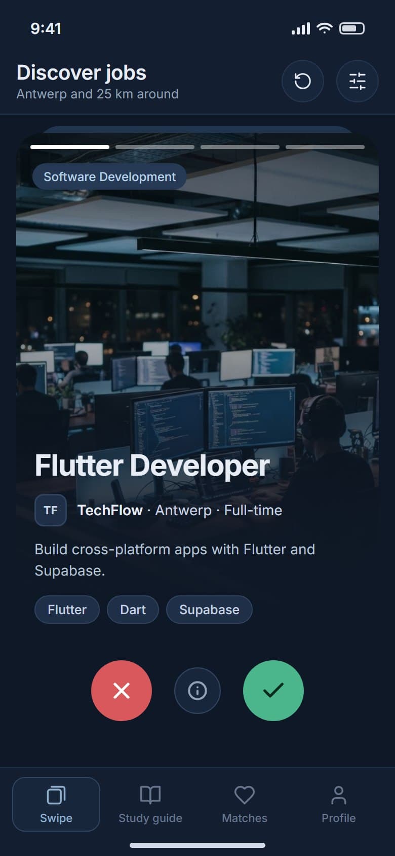
Swipe through jobs as photo cards.
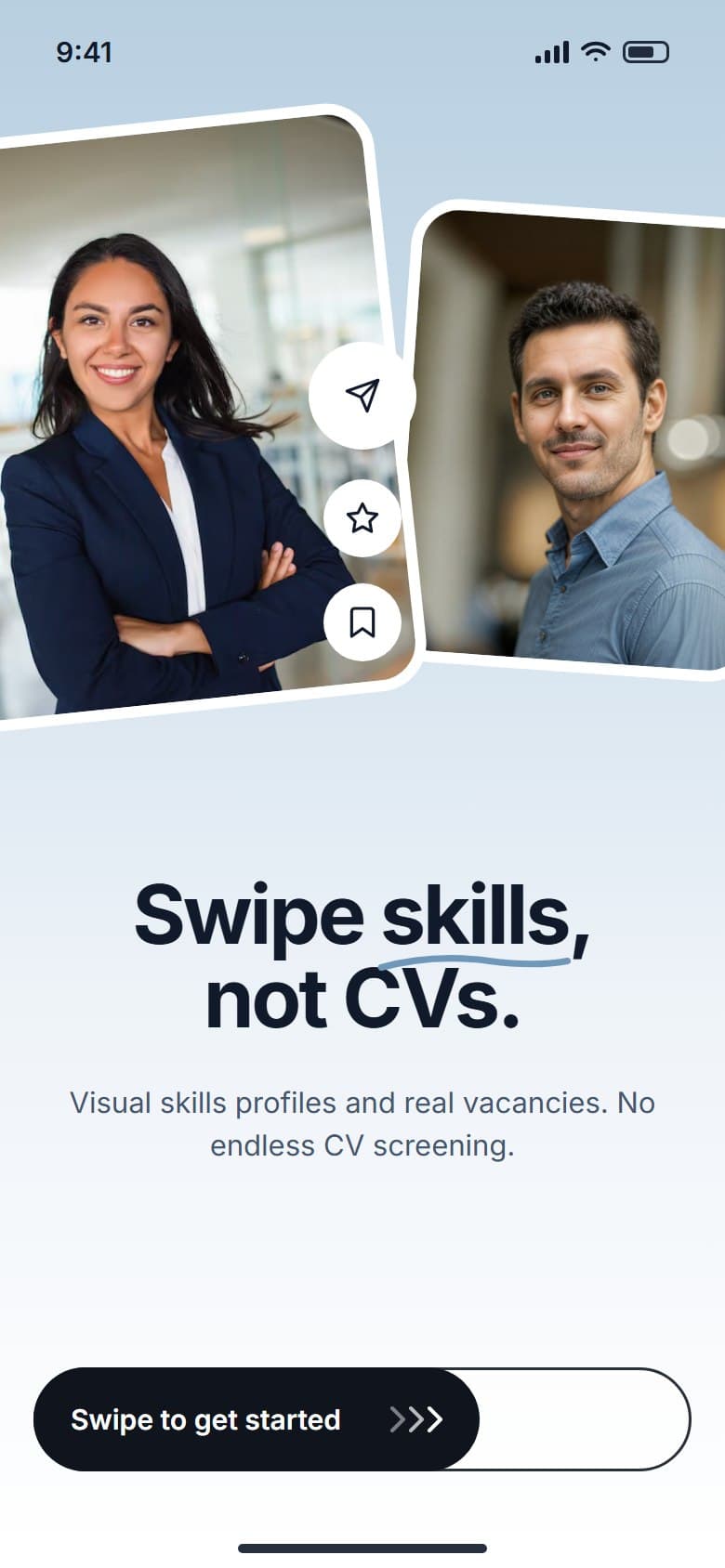
Journey
3 screens
from the welcome to the full role
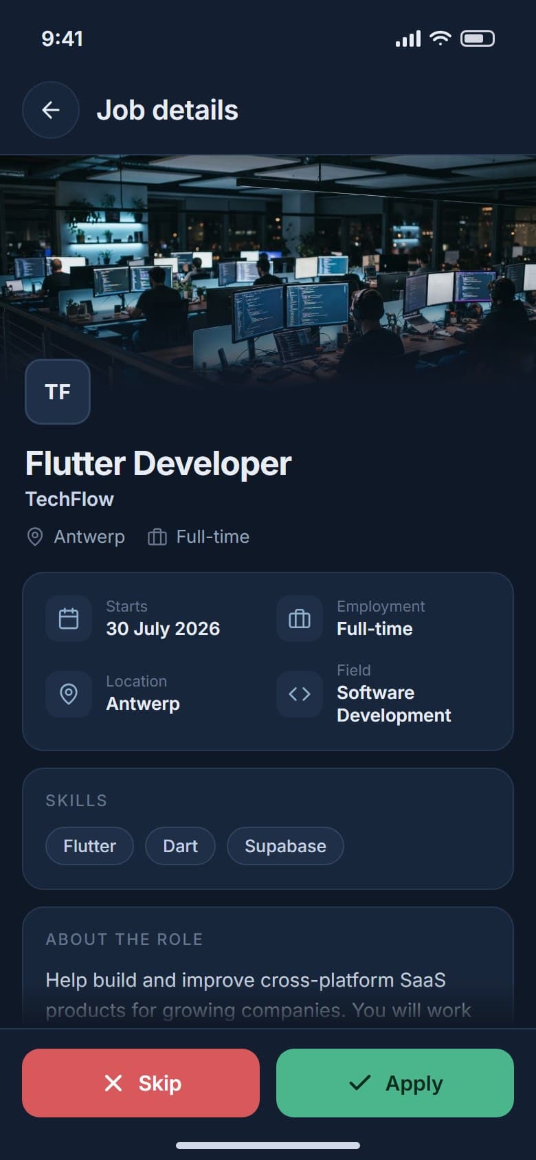
A job arrives as a large photo card with the role, place, contract type and skills on the front. Skip or apply with a swipe, or open the card to read the whole role before deciding.
02Match and talk
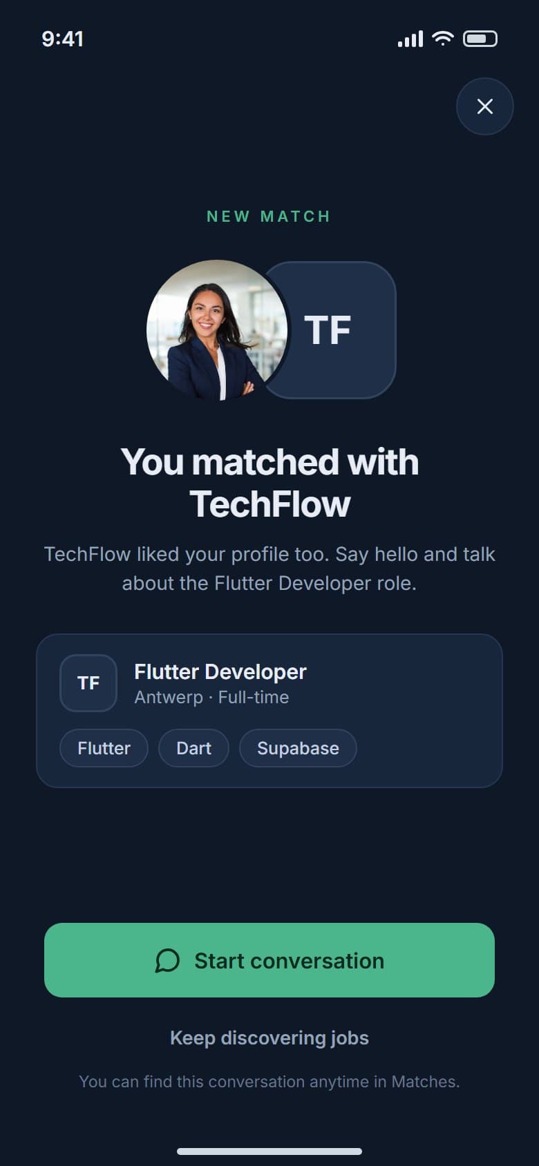
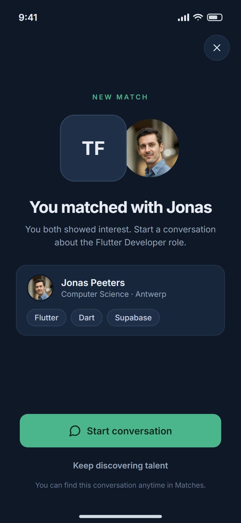
Each side sees the two identities in the order that suits it.
Match
2 yeses
needed before anyone can message
Both sides see the same celebration screen, with the other party's identity and one clear way to start a conversation.
03Discover talent
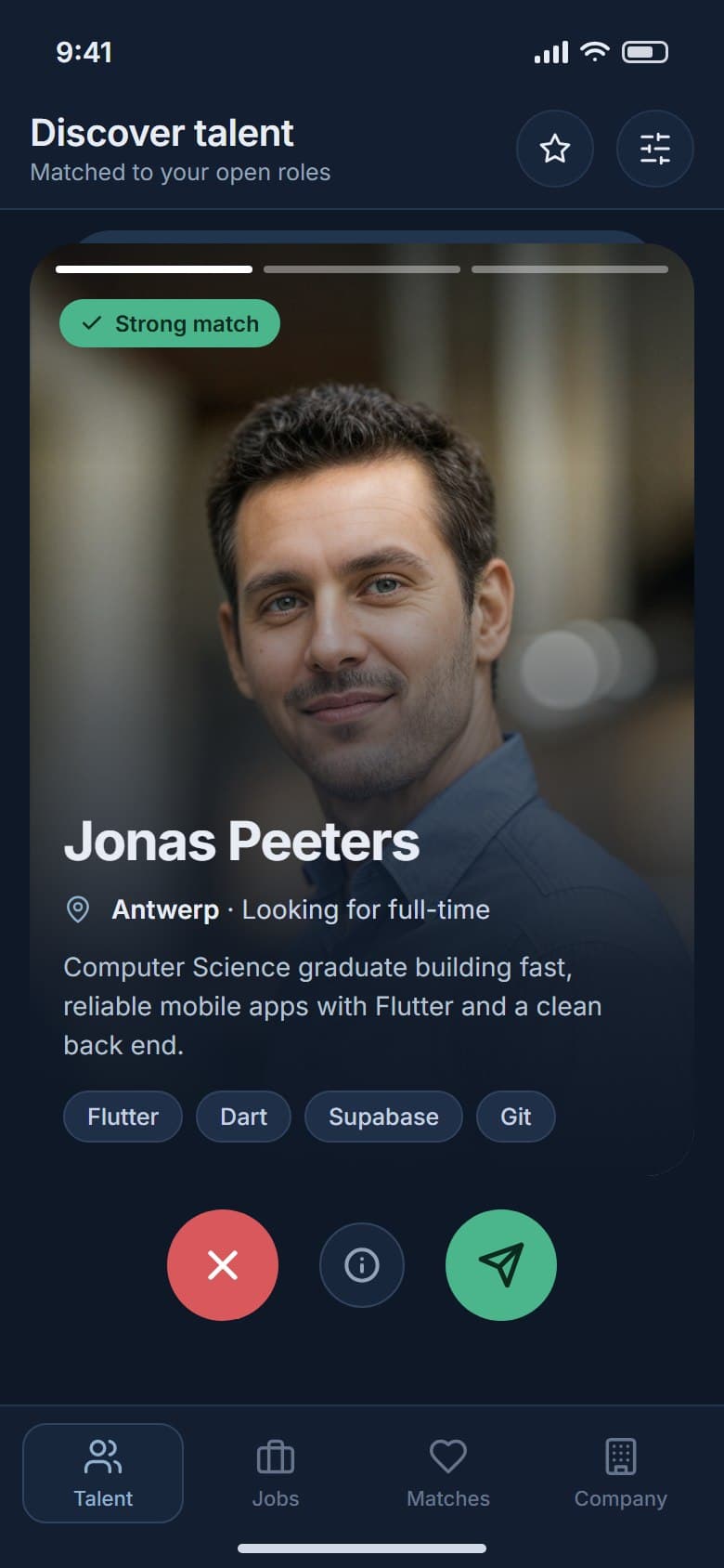
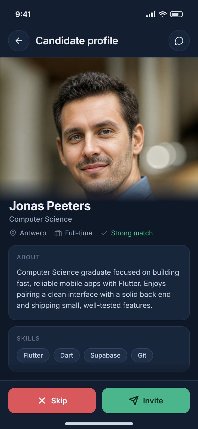
The same swipe for companies, with a full candidate profile one tap away.
Company view
1 deck
of candidates with a match label
Companies swipe through candidates on the same kind of card, with skills, region and what they are looking for. A profile adds study, school and a short bio before an invite is sent.
04Internships
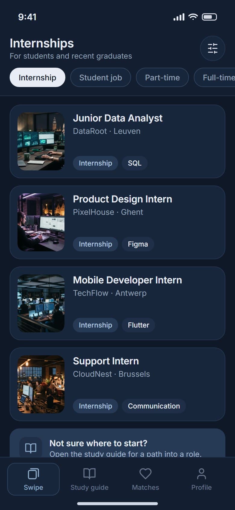
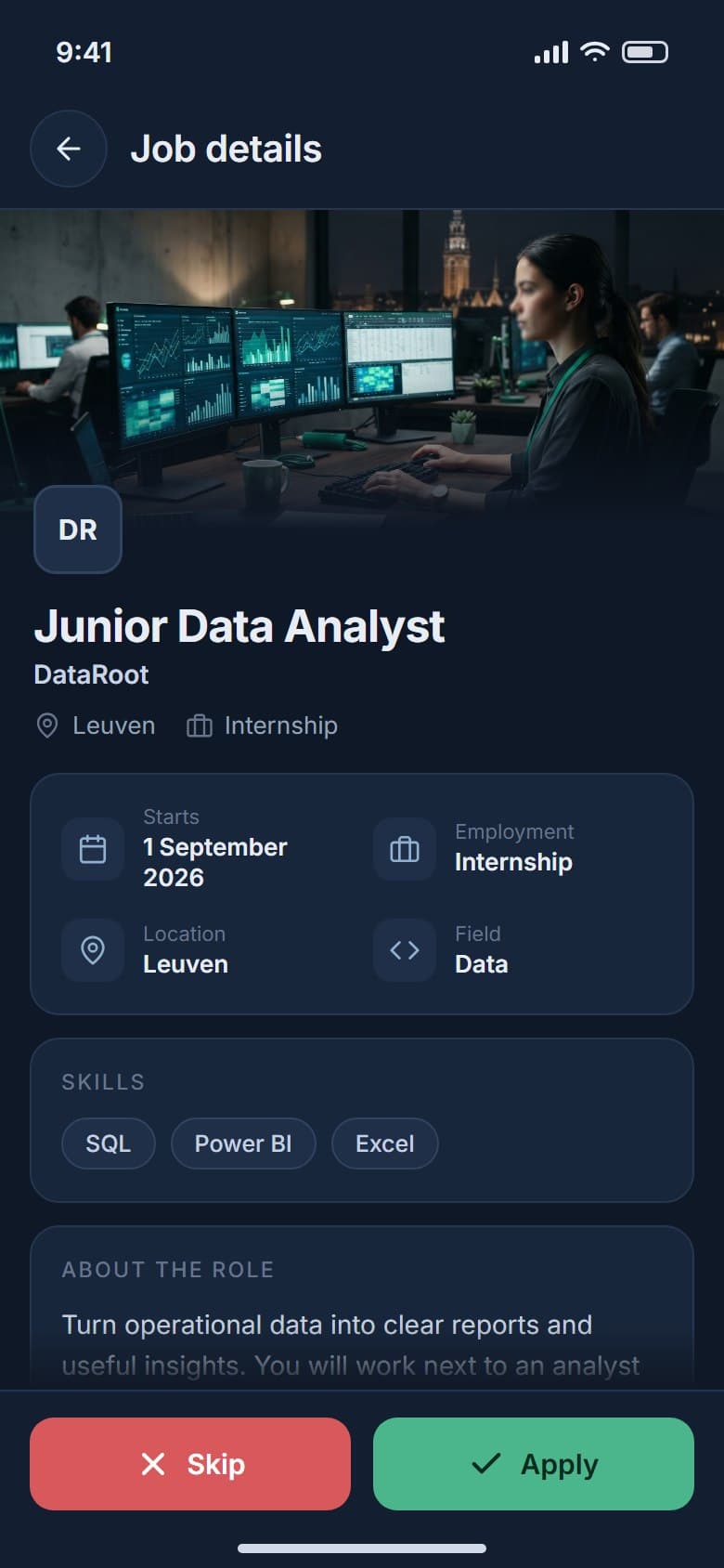
A filtered list of internships with the company, place and main skill on each card.
Early careers
1 filter
turns the deck into a list of internships
Students and recent graduates can narrow the job feed to internships, student jobs or part-time work, and read each one in full before applying.
05Student learning
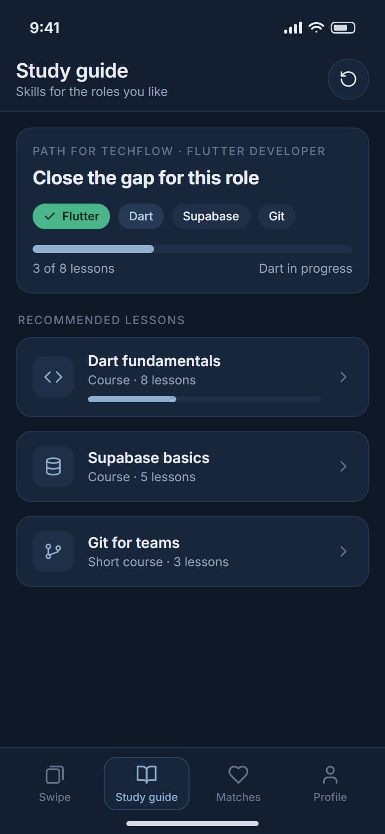
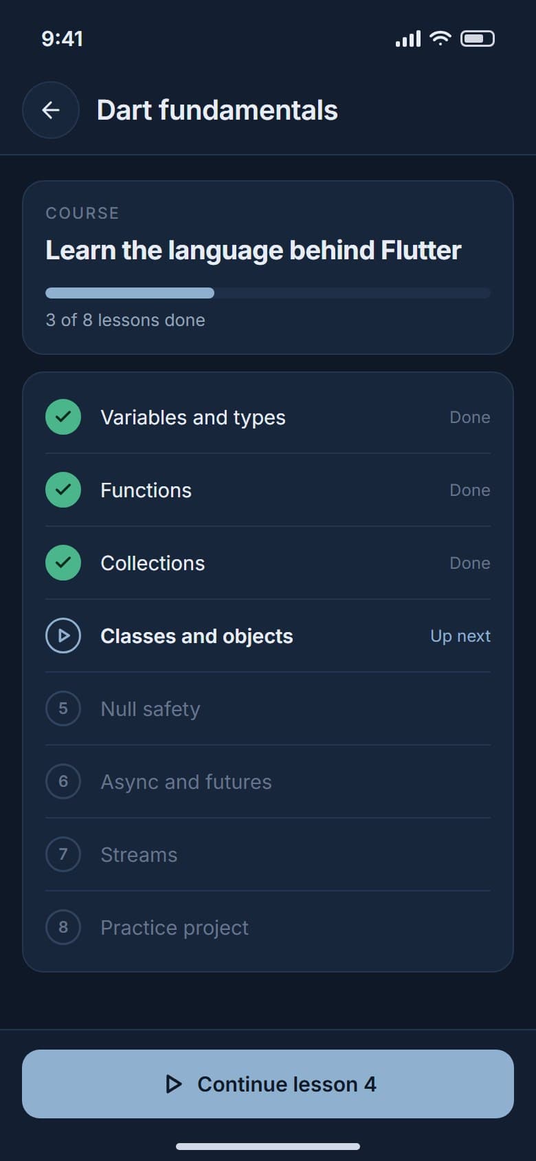
Learn a role's skills lesson by lesson.
Study guide
1 path
for each role a student likes
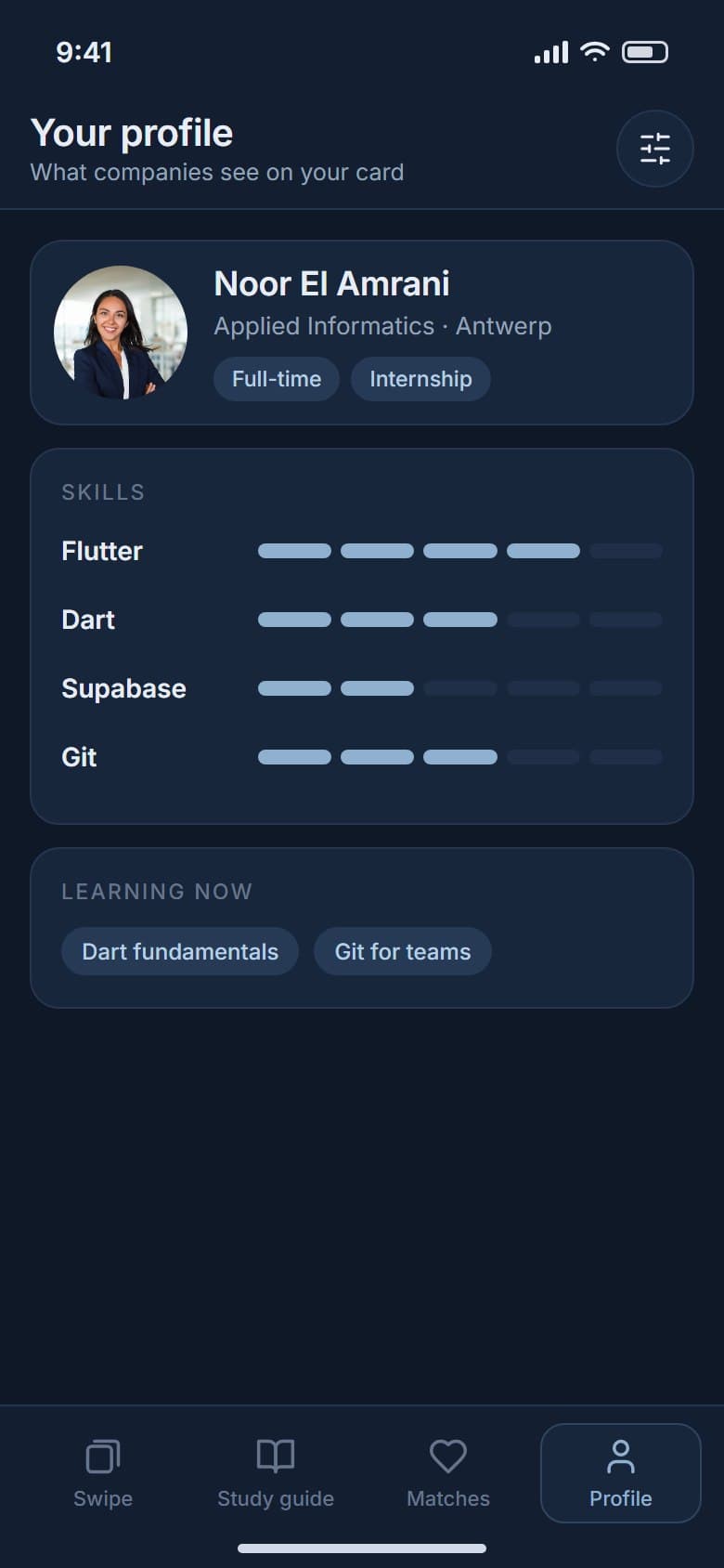
The study guide turns a role's skills into a short path of courses and lessons, and the skills a student builds show up on their profile card.
Outcome
Job seekers and companies now use what reads as one app, and students get their own way in through internships and the study guide.
- Job discovery
- Detailed roles
- Candidate profiles
- Skill tags
- Match states
- Company talent deck
- Internships
- Student study guide
More case studies
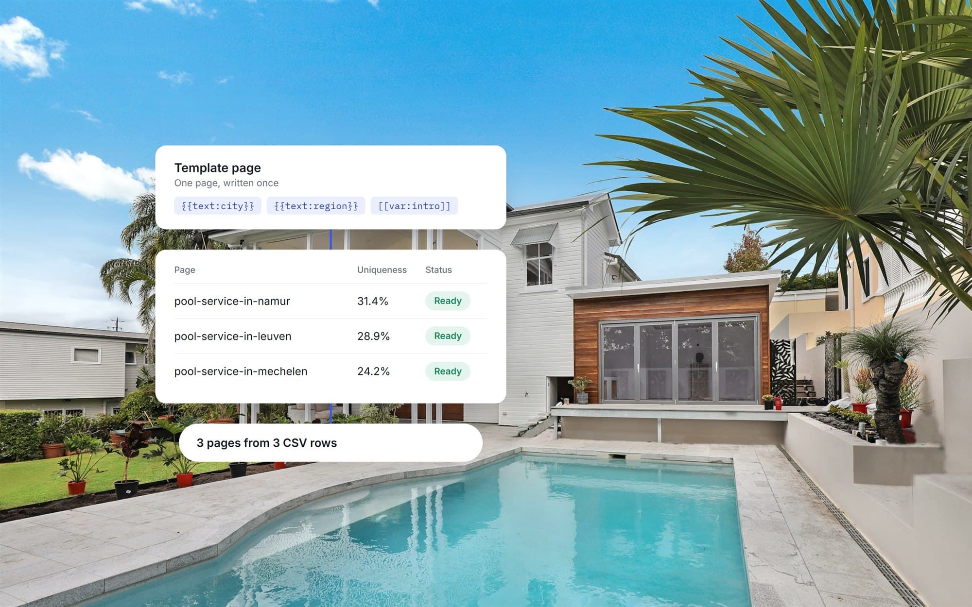 Location publishing automationA custom WordPress plugin that generates location pages from one template and a CSV, with SEO fields and publishing controls, added without a rebuild.View case study
 Commercial vehicle marketplaceA closed B2B marketplace where buyers, sellers, transporters and technicians each work in their own flow, from listing and sealed bidding to transport.View case study
Want a product like this? Let’s talk
Tell us about the workflow that needs to run on software. We’ll come back with how we would approach it.
Discuss a project